1-781-246-4888 Home About Printing Direct Mail Design and Marketing Blog
Print Graphics - A family of printed products and services since 1964 Upload a File


GRAPHIC ELEMENTS

Logo Mark
To differentiate Fuzions from the competition, we kicked the swirl concept up a notch by incorporating a ‘cyclone’ graphic, which suggests energy, excitement and–again–the fusing (blending) of flavors. A spoon placed into the ‘bowl’ of the cyclone identifies the graphic element as a food product.


Primary Color Palette
The primary color palette was chosen for its fresh, bright, bold and energetic nature.


Secondary Color Palette
To provide a base for the logo that allows the ‘cyclone’ graphic to pop, we incorporated a secondary palette (fourth color) to be used in the company name.


Typography
We chose an unadorned typeface with rounded ends to provide softness and friendliness, with enough personality to compliment the ‘cyclone’ graphic, but not get lost by its energy.


Tagline
To reinforce the name and make a branding statement, we created this tagline that ties to, and defines the reason for the ‘cyclone’ with the spoon.


THE LOGO

We created three variations to address various marketing and design needs:

FOR SIGNAGE/LARGE FORMAT LOGO WITH TAGLINE LOGO WITHOUT TAGLINE

LOGO IN WHITE

The white logo is placed into an oval that mimics the shape of the ‘cyclone bowl’. This treatment can also double as flavor identifier labels.


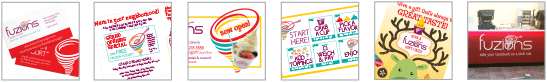
MARKETING MATERIALS

Careful attention to, and control of, design elements creates a unified look, which over time contributes to creating a strong visual brand.

Click on a thumbnail to see some of the various materials we designed and produced.


Questions or Comments: dee@pgi.us

> > > > > >
   
Social Media Links
© PrintGraphics, Inc. 2016. All rights reserved.