

| |
|
|
|
|
|
|
|
| |
|||||||
|
|||||||
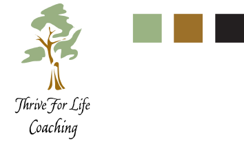
REBRANDING THRIVE FOR LIFE |
w |
Thrive for Life is a life coaching service that provides direction, clarity and accountability to help women make decisions, set and reach goals, or deal with problems. We were approached to help them rebrand their look, which they felt was dated and inadequate. However, they felt that the use of a tree was important, because the tree symbolized growth and strength; two fundamental aspects of the coaching experience.
|
|
|
ORIGINAL LOGO The strongest aspect of the original tree is the sense of dancing. There’s an almost joyful quality, which is appropriate to the outcome that Thrive for Life services provide. The use of sage green and soft umber are warm, inviting and appropriate to the image. However, the random shapes of the ‘leaves’ and ‘trunk’ give it the quality of a clip art graphic that might be used in a newsletter or interoffice communication; the hand-lettered (calligraphic) style of the typeface is dated and too delicate to communicate strength; and black is too stark against the softer colors in the palette.
|
|
|
|